I teach graphic design at Vancouver Island University.
This student work shows the outcomes of projects designed in the classes I currently teach. Their work clearly illustrates the potential we have as creative human beings and the power they hold as visual communicators. – Nancy
Branded package series. Year 3 student work.
Challenge: Create a branded package series with considerations for the function and ecology of the package.

Jessica Reid drew from her frustration with a poorly designed spice packet and reinvented the brand to appeal to young, at home chefs. Its clever design includes considerations for the environment by using less material than the original packaging and an innovative stacking order needing less storage space, easy to read label and color coding system and even a flip top to ensure freshness and durability.
This project won Jessica a $500 GDC scholarship to go to her last year of school.
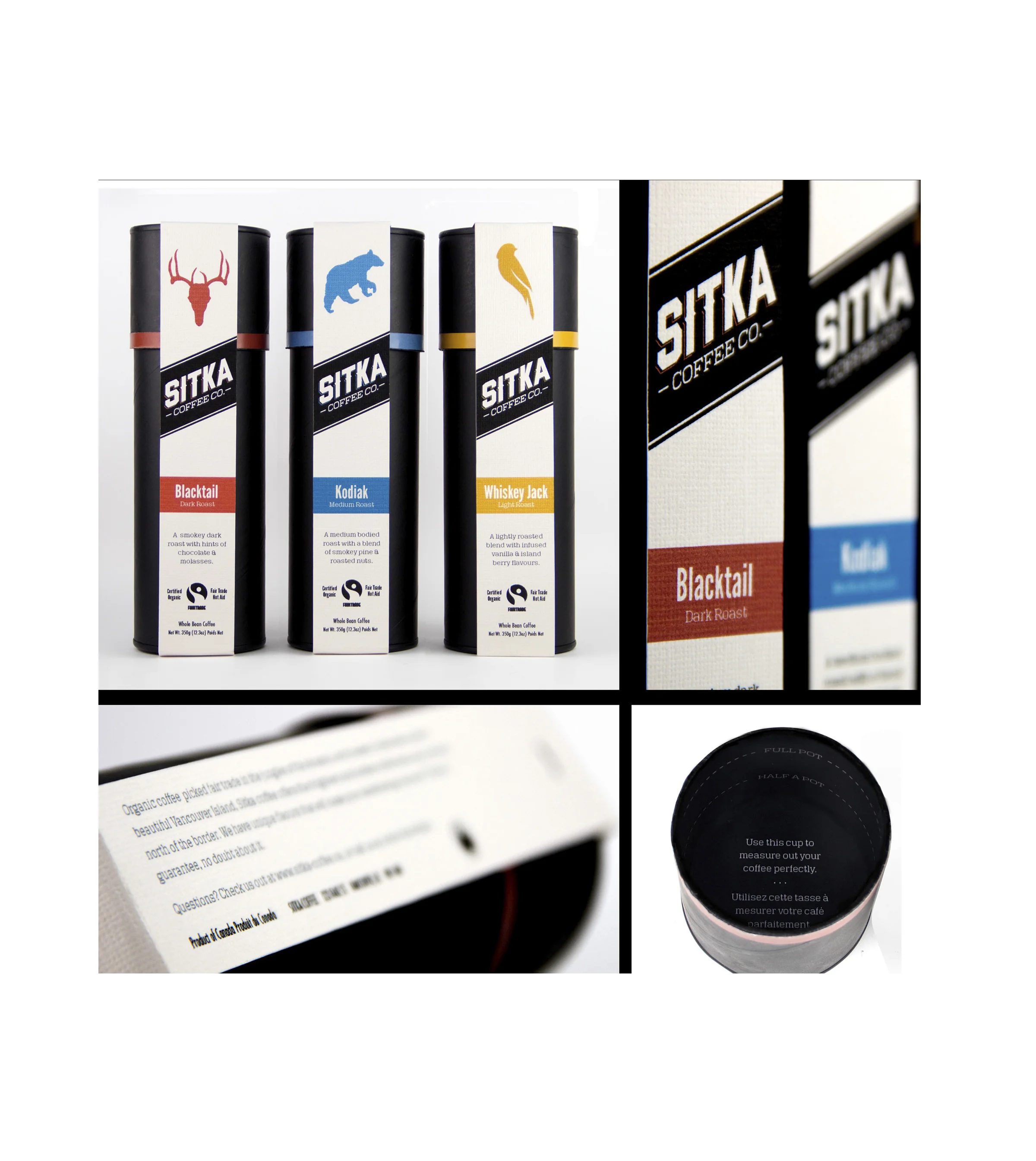
Reese Patterson designed a series for an imaginary West Coast coffee company named Sitka. The series was designed for young professionals who love their coffee as much as they appreciate good design, so the series would need to talk to their sensibilities. Reese knew that his audience would not use poorly packaged or overly decorative boxes sitting on their counters and the cans needed to be functional. Reese designed a simple labeling system that could be taken off to reveal a black reusable canister, which revealed a subtle embossed Sitka logo on top of the lid. He added a single band of color for each canister for flavor differentiation. Reese turned the canister lid in a handy measuring device for the perfect cup of coffee.
1 Book, 5 weeks, 5 concepts. Year 2 Student Work
Challenge: Read either Blink by Malcolm Gladwell or The Art of Simplicity, by John Maeda then, each week for five weeks, conceptualize a different cover design using one new technique as follows: photography; typography; illustration; found objects and collage.
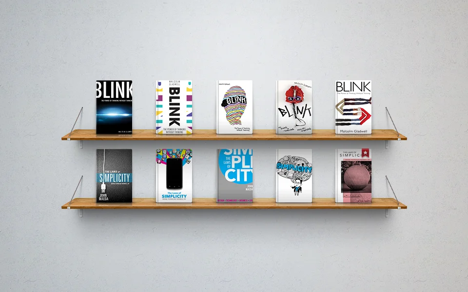
Top shelf covers by Rio Trenaman. Bottom shelf covers by Emily Johnston.
Anthology in magazine format. Year 1 student work.
Challenge: Conceive an anthology on the topic of your choice then design their content into a 20 page, full colour magazine format. Students define the audience and consider appropriate typographic and navigational cues throughout.

Greg Dubeau created a magazine compilation of essays by Francis Bacon. He allowed himself to interpret each essay and design his understanding of the content through the use of typography and dynamic layouts. The spreads vary between experimental type to engaging photography and typography set within a structured grid.
Greg's project submission was published in Creative Quarterly Magazine and also won him the inside cover page for the #20, 2010 issue.
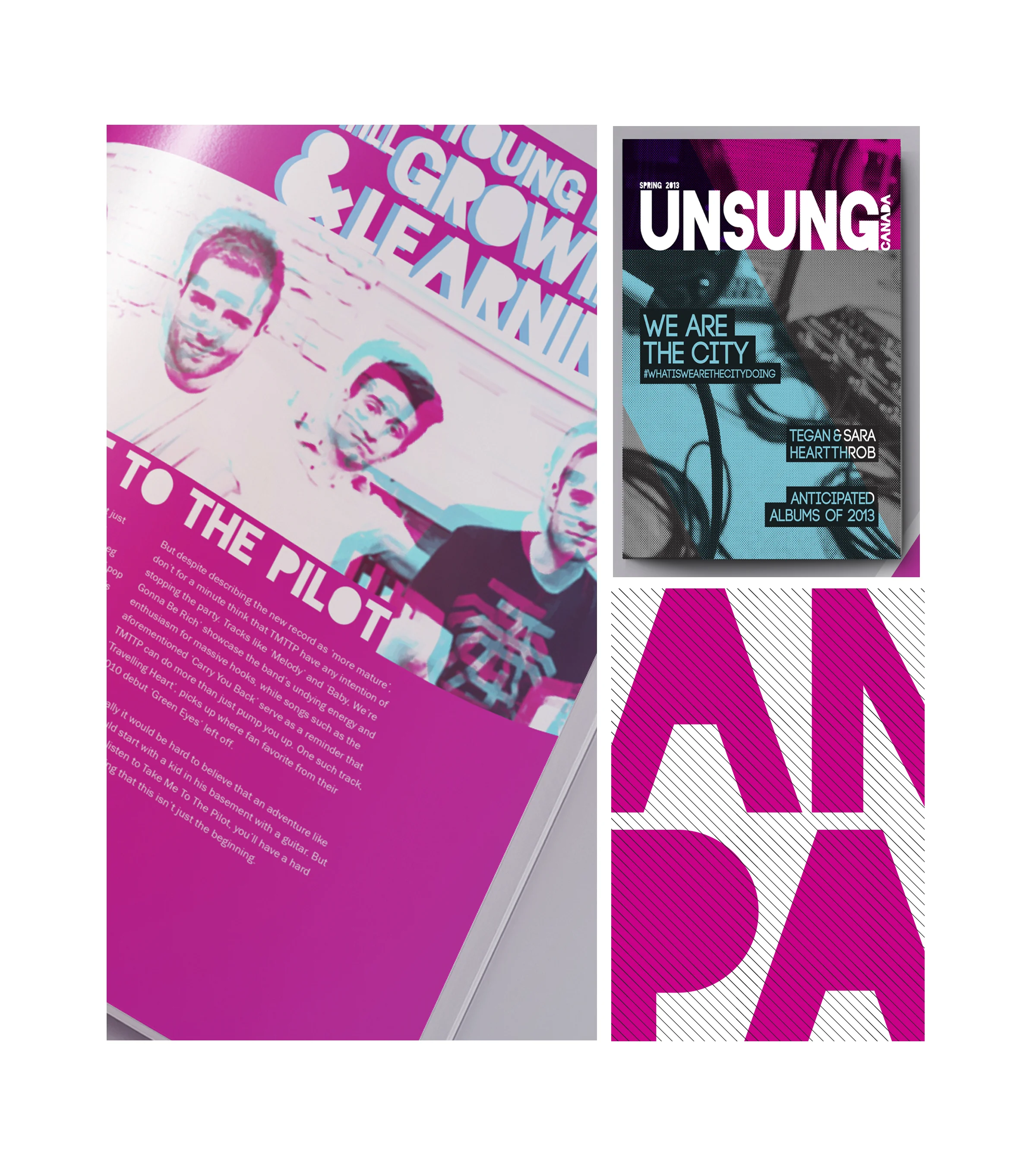
Kaytee Davis focused her anthology on the topic of up and coming Canadian bands. Her design included the use of a clear, underlying grid, bold expressive pull quotes and an exciting use of colour.
Kaytee's project submission won her a $1000 Graphic Designers of Canada student scholarship and is featured on the education home page of the GDC website.
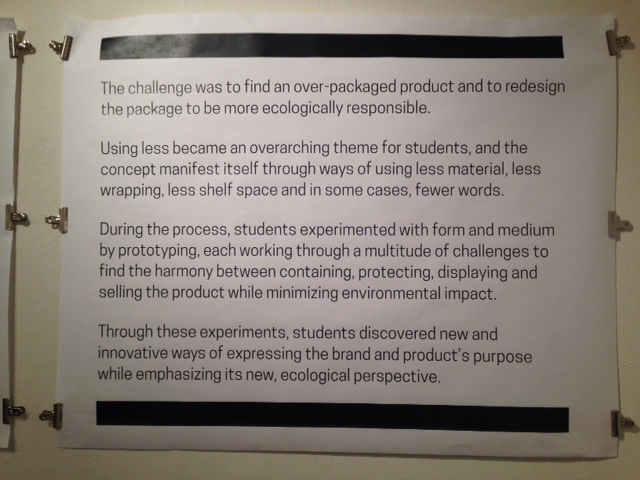
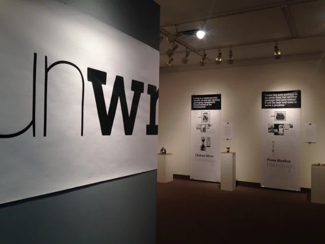
3rd year package design students and I put together an exhibit titled "Unwrapped" A package design exhibit where less is more.
For this project, students were tasked with rethinking product packaging to be more ecologically sensitive. What struck me with the outcome of these projects was the work students put in behind the scenes—their iterative process and thinking—which is rarely shared.
Unwrapped was an opportunity to showcase their thinking as much as their solutions. Thank you to the local cable channel for adding our event to their clip on the same topic.